Development
Development Process
When first developing our game, we began with figuring out how a car moved on a plane. At first we assumed that a transform would work fine for an object with physics, but this caused several errors that made movement problematic, if not physically impossible. After playtesting and moving to a physics-only based movement, we were able to progress in other aspects of our game’s development. Car and player models were designed and made by Chang, and Ethan and Ava designed the level the car would drive on. Alexia added sounds to all collisions and scenes, while Caitlin coded the car movement and player physics.
By working in different scenes, we were able to avoid most merge conflicts and also divide up the work by duplicating scenes and adding any mechanics or general changes. We mainly divided up the scenes into one for working out car movement, one for button interaction, another for coloring and scaling assets, and one for testing particle systems.
Another big step in our development process was figuring out the “vomit” script. The third player’s ability to obstruct the driving player’s view (by creating a splatter on their windshield) was an important mechanic we wanted to include. Chang coded the script that makes the vomit sprite stick to the windshield, while Ava worked on the particle script for the ability. This mechanic was successful and one of the smoother parts of our development process.
One of the more challenging parts of creating the game was coding the physics for the objects thrown by the passenger player. An issue we ran into was the player throwing their objects through the car walls, as well as not adding enough force to the movement. After much playtesting and debugging with the professor, we were able to figure out how to reorganize the collision layers to avoid errors. This was a challenging, yet rewarding part of the process, as it finalized an important mechanic for the final game.
What went right
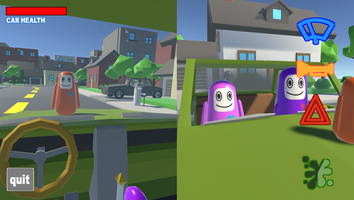
When thinking about player interaction, we knew that we would want to allow the player to see all of their available options in front of them as a UI element, instead of an in-game object that they would need to look around for. It is easier for the player to just make key presses, instead of having to interact with things in the environment. We were also able to implement a cooldown for the amount of time you have to wait before the next “attack”, using the UI, we were able to visually show the time of the cooldown using transparency.
We decided to use a silly and poppy sounding tune for the main music and goofy sound effects as well. The song was made in the chrome songmaker and the sound effects were sampled and edited in Adobe Audition and Ableton.
The player's health in the game was the “car health”. This acted as the car’s durability and it would decrease as the player collided with more obstacles. The UI health bar was made using an image and was being controlled by a health bar script that determined the horizontal fill area of the image.
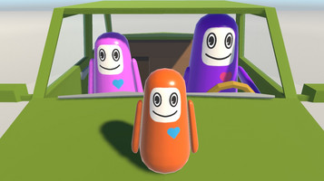
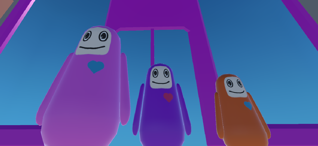
The unrealistic character design fits well with the concept. If it had been designed in the form of a real person, it would have felt a sense of separation from the geeky game concept. The newly tried IK system helped a lot in saving the details of the game. The IK system is used when the player on the hood looks at the driver and the driver grabs the steering wheel.
What went wrong
We had difficulties with the input manager and using the event system for selecting our buttons. It may have been our versions of Unity, but we were unable to get our gamepads to connect and control our game. Although, when tested with other computers, the gamepad worked. This caused issues in later development when mapping controls, as we were unable to test them ourselves on a physical controller. The event system was also problematic, as multiple keys were mapped to the same input (like select and horizontal control). This made it complicated to use buttons for ability selection, so we moved on to using images and their built-in fill tool instead. Changing this approach facilitated our development, and made it easy to modify and control the player buttons.
We ran into trouble when trying to bind gamepad controls to our players’ movements because we were not able to use Unity’s new input system with the player movement script we had made. Despite others being able to control the players with their gamepad, we were not able to get our own controllers to move the players while working in the Unity project.
3 players will play this game, but the balance of the 3 is not good. In the case of the driving player, the other two players interfere, but the two children do not receive any penalty except cool down. We agreed that giving them a difficult is obviously necessary, and add interactions with each other. The kid on the hood has a chance to vomit every 4 seconds, but there is nothing the player can do in 4 seconds, and having the opportunity to vomit every 4 seconds is too obvious a pattern. The player who drives will read this pattern right away. We thought we have provided players with too laid-back gameplay. Therefore, we felt we needed to provide a little more dynamic and tense gameplay with adding unexpected variables.
What we learned
Even though we had tried our best to avoid merge conflicts by duplicating scenes and logging when each of us pulled or pushed, there were times when we still encountered errors and had to reset our local repos. Though we were always able to debug the merge errors and never had to redo too much progress, we would have a much better workflow had we made branches off of the repo. This would also be much easier if we were to utilize git kraken to keep track of changes to the project. For future projects, we will take the extra time to set up and understand git so that we can hopefully avoid any errors.
Something we had to learn the hard way during our presentation was the boundaries of the level were not properly set up. Playtesters were able to drive off the road and sequentially off the plane, diving infinitely into the Unity void. This is very much a basic first step but is easy to overlook in development, because of how shortsighted one becomes while completing their individual tasks. This was a good reminder to keep in mind though, and after this experience hopefully none of our games will ever have the same problem.
Group Roles & Responsibilities
- Alexia: scene management, sound design, player health
- Ava: UI design, level design, particle systems
- Chang: 3D asset design,animation, coding
- Ethan: 3D asset design, level design
- Caitlin: producer, coding
Ava created 2D UI assets to use during the playtesting and for the final version of the game. After the
3D environment assets were brought into unity and colored by Ethan, Ava duplicated them and placed them around the scene, to create the layout for the level. Once the final car and player prefabs were added into the final scene, Ava added the particle system for the player vomit and car exhaust. Chang was in charge of making 3D assets, players and a car. Once the characters were created, Chang made them turn their heads, and then grabbed the steering wheel and turned it. Chang did some code for a player on hood.
Future Development
The first thing that needs to be updated with the next task is to balance the players. Currently, 3 players have little interaction, and kid players influence a driver unilaterally. Thus, what we decided to make for the next step is to create mechanics where the player interferes with the kid players. The first idea is to make the player on the hood fall when the driver makes a left or right turn. Then, the player has to hit the left and right keys repeatedly to get up. Another idea is to tie the child sitting on the right with a seat belt to prevent throwing toys.
Another idea we had to further develop this game would be adding harder level design for the driver. At the moment, the road is quite easy for the driver to navigate, due to the still obstacles and short level. For a future iteration, we would add moving obstacles (like pedestrians, other cars, etc.), the passenger driver’s ability to obstruct movement (hitting the steering wheel, throwing objects in the street, etc.), and a longer path to drive on. This would greatly increase the difficulty for the driver and create more interesting gameplay.
One idea we would have liked to have time for was a police/patrol AI to pursue the driver. A suggestion we received during playtesting mentioned a red light mechanic, where the driving passenger would need to stop at the light to avoid a police chase. This was ambitious for the time frame of this project, so we did not attempt to create it, but it would add to the challenge of the game. Creating more rules for the driver, with consequences if these were not followed, would be another fun mechanic to later add to our game.
We also wanted to add a feature where the child players had the ability to change the music using the radio in the car
- Radio (ability to change the music)
- A skybox that matched the rest of the environment assets
Get are we there yet?
are we there yet?
An asymmetrical driving game
| Status | Released |
| Authors | caitlinkeating, Alexia Christou, changwoo624589, soppart, avak |
More posts
- Playtest & FeedbackNov 23, 2020
Leave a comment
Log in with itch.io to leave a comment.